
Shaping the Brand Experience
GOODTH!NGS is a space that moves between two moods: calm mornings upstairs with coffee and food, vibrant evenings downstairs with DJs and drinks. The visual identity reflects this shift while staying rooted in warmth, rhythm and clarity. Designs were created across key touchpoints, including website, menu and social media, each shaped by the atmosphere and pace of the venue.
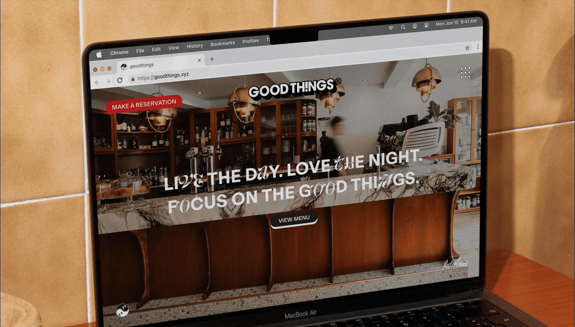
Translating Space into Web
The website brings the physical space online, with clean layouts and layered contrasts that echo the Day & Night experience. Typography and colour choices carry the brand’s playful but focused tone, while CTAs reflect the GOODTH!NGS identity through tactile 3D buttons, guiding visitors smoothly from menus to event bookings.

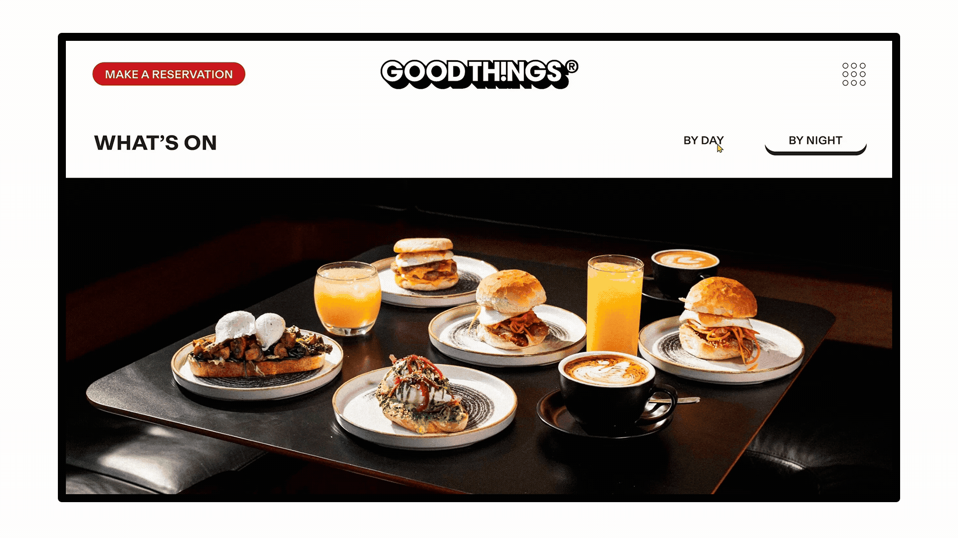
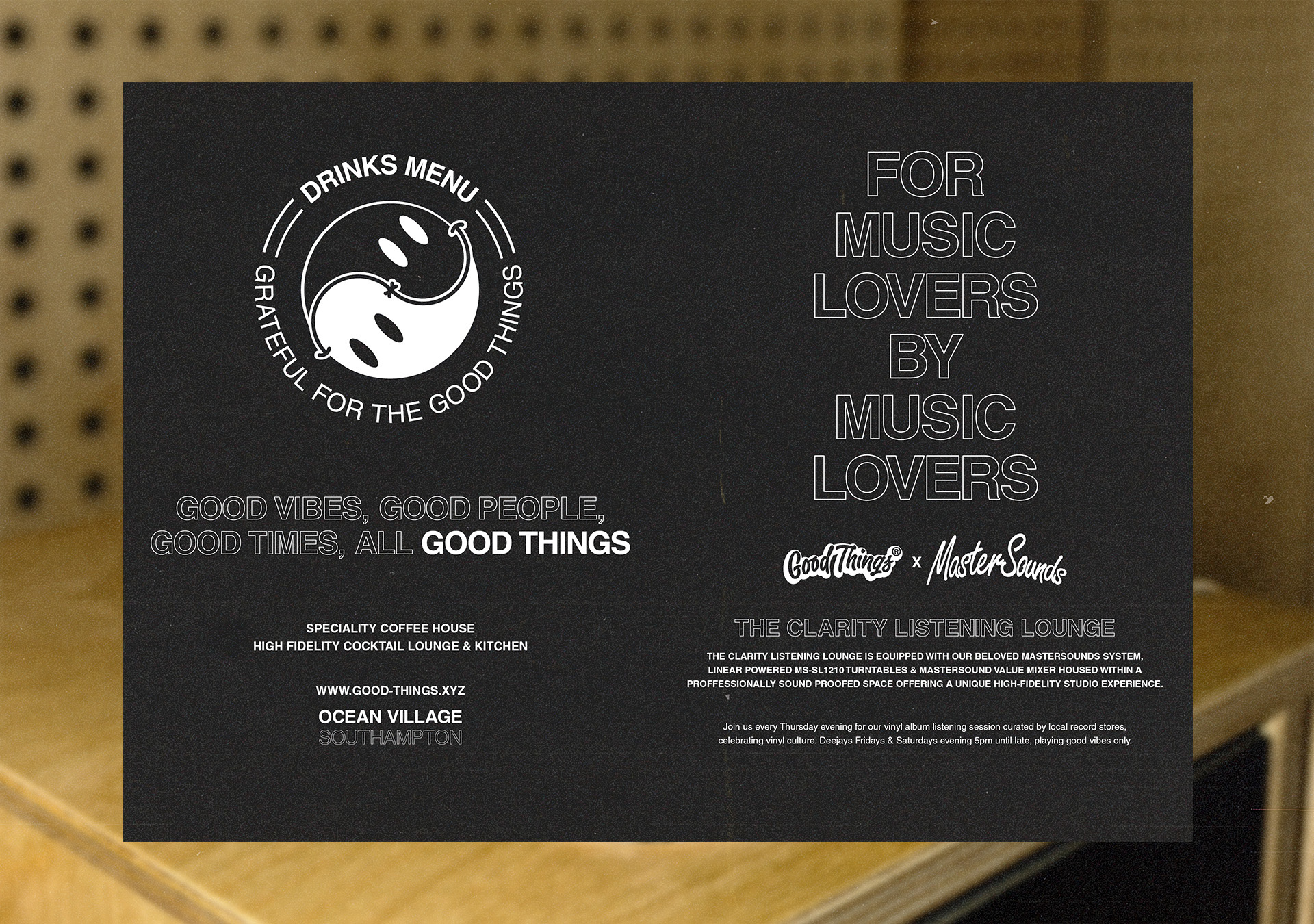
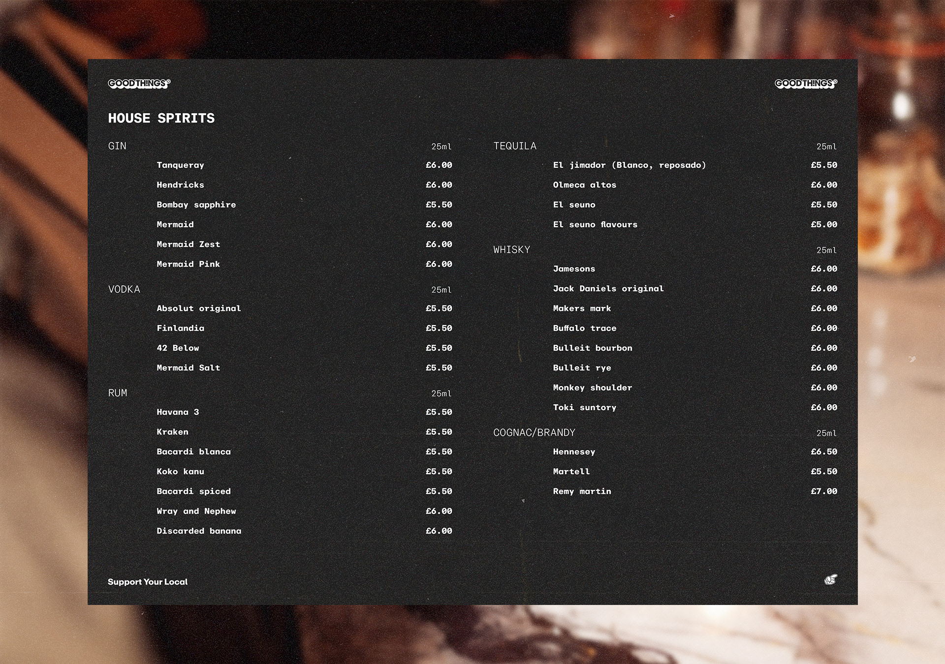
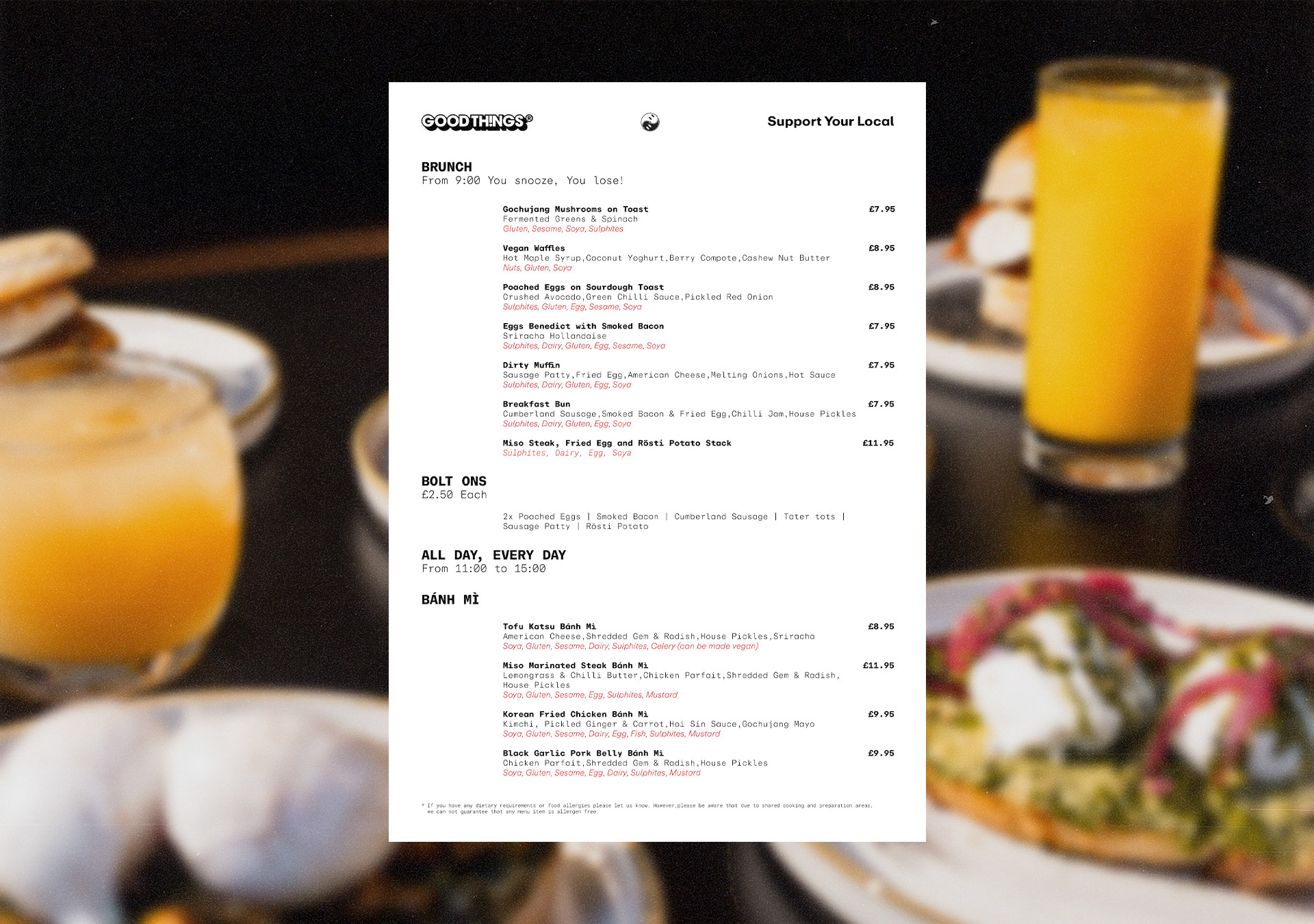
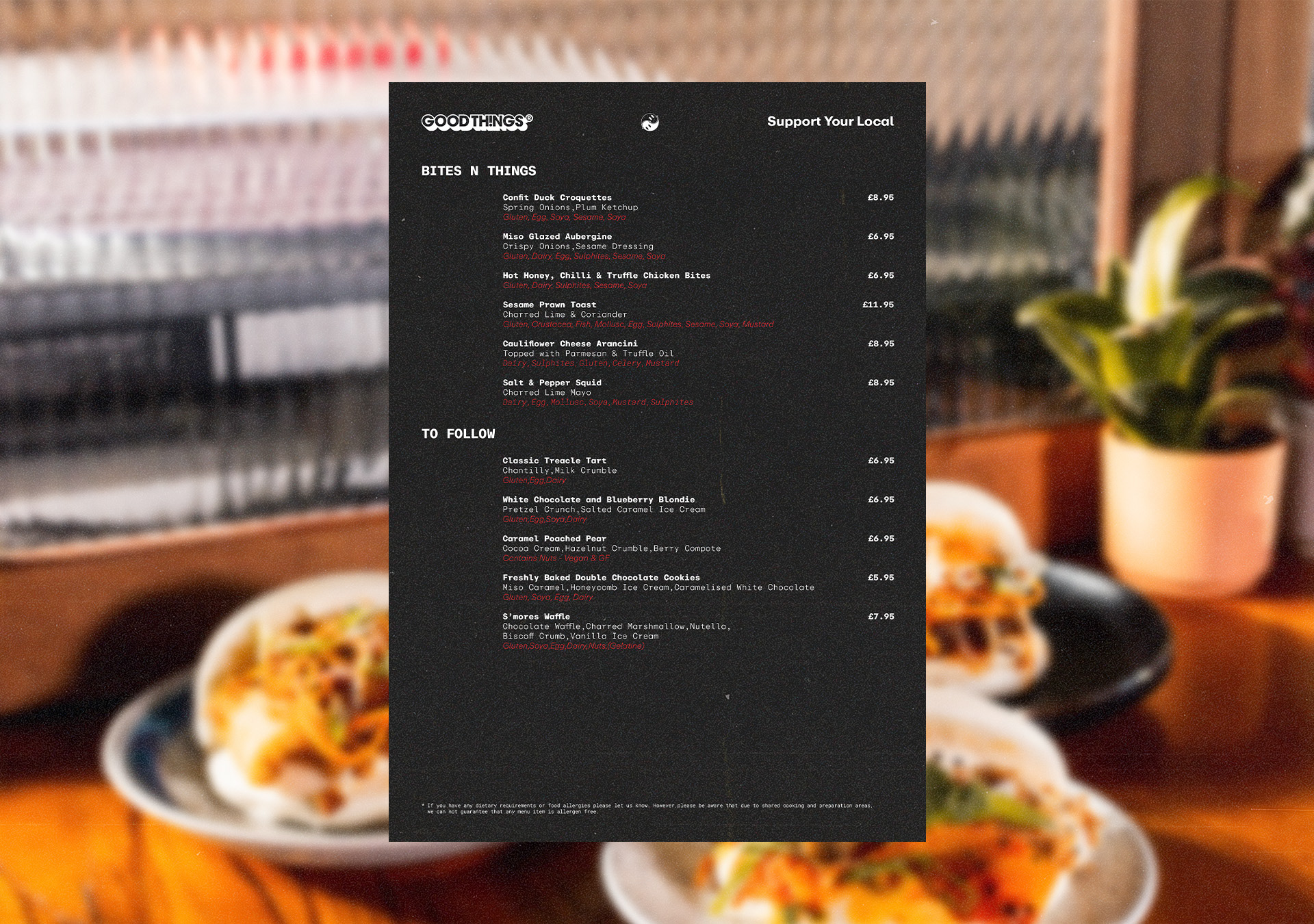
Structured, Flexible Menus
The menu applies the core design system to organise food and drink offerings clearly, using structure and type to separate day and night selections. Premium and house spirits are marked through visual hierarchy, while the layout mirrors the pace of the venue: steady, uncluttered and adaptable across formats.
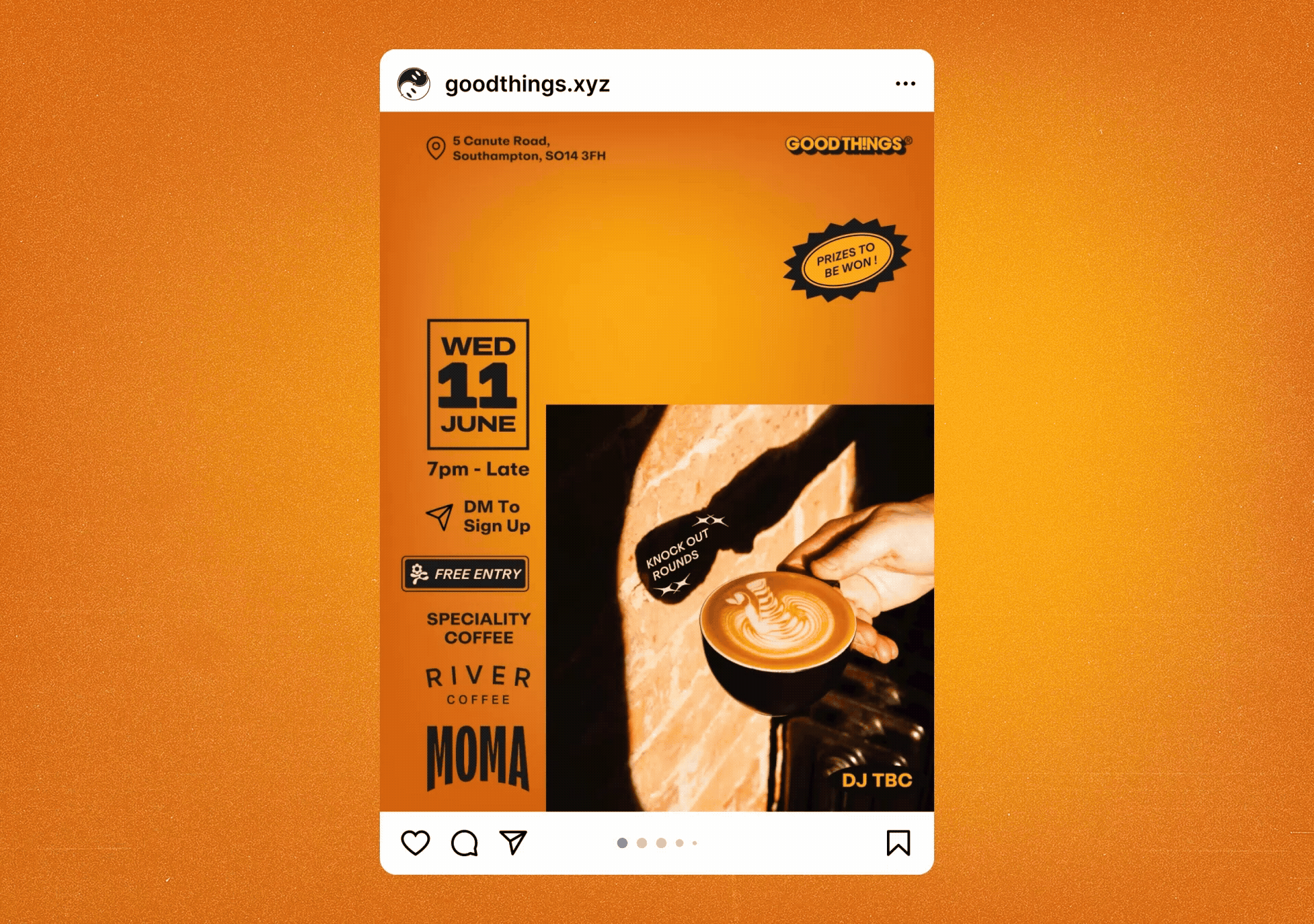
Adaptive Social Presence
Social media extends this system further: posts for Valentine’s events, coffee competitions and launch teasers adapt the visual identity to each occasion. While the core remains consistent, design decisions shift with the theme: colour palettes, type treatment and layout respond to the moment, allowing GOODTH!NGS to stay recognisable and fresh across every event.